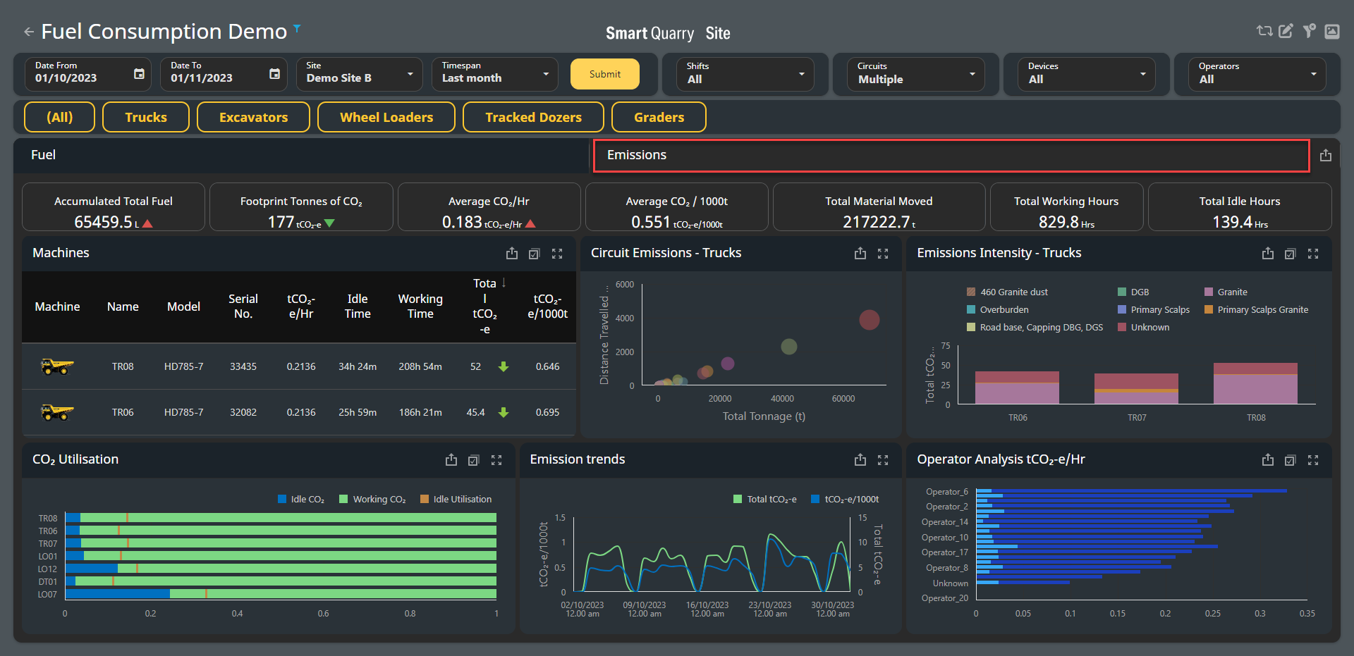
The Emissions dashboard monitors emissions from your machines and displays the CO2 emissions at a given site over a given timeframe. You can view the overall emissions for a site, and also review emissions by machine, operator, and more.
Any widgets displaying information related to material movement are specific to trucks. This does not affect the overall emissions information displayed, however this can cause some truck-specific fields to display a blank result when non-truck filters are applied. Further, the term "tCO2 -e" is used throughout this dashboard; this represents "tonnes of CO2 "
Accessing the Emissions dashboard
To access the Emissions dashboard:
|
|
|
|
Setting the timespan and site
You can configure the timespan to show a site's emission for a custom period, or select a predefined timespan (such as a day, week, month, and more) to display. These options are available in the top-left corner of the dashboard.
To set a custom timespan, click the Date From field and select a date from the calendar that opens, then click the Date To field and select a date from this calendar as well, then click Submit.
To set a predefined timespan, click the Timespan field and select a period from the drop-down menu that opens, then click Submit.
To select a site to display, click the Site field and select a site from the drop-down menu that opens, then click Submit.

Configuring information to display
You can configure the Emissions dashboard to display all shifts, machines, operators and more, or to only display select attributes.
To configure which information displays, click the Shifts, Circuits, Devices or Operators fields, then make selections as needed from the drop-down menus that open. Alternatively, select All from these drop-down menus to view all results; each field defaults to All.
To only display information from a certain machine type (such as trucks, excavators, and so on), click the relevant button. To display all machine types again, click All.
You can only highlight one machine type at a time

Filtering by widget selection
You can filter the emissions dashboard by clicking an entry in a widget. For example, in the Machines widget, clicking a machine highlights it; this automatically updates every other widget on the dashboard to only display information related to this machine.
After you have highlighted an entry, you can click other entries in other widgets to drill down further into the data.
For example, you can click a machine in the Machines widget and then click an operator in the Operators widget; this will automatically update all widgets to only display information related to this machine when it was operated by this operator.
You can also select multiple entries from the same widget; click the Multi-select icon in a widget's top-right corner to activate multi-select, then click two or more entries as needed.
To clear all selections in a widget, click the Clear icon in the widget's top-right corner; if you have made selections in multiple widgets, you must click the Clear icon in each widget to clear all selections.
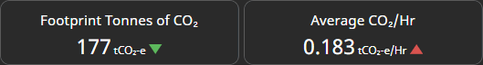
Summary widgets
The summary widgets display emission summaries for your chosen timespan at the top of the dashboard.
If the information the Emissions dashboard displays is changed (such as by highlighting a certain machine type or operator, or if a filter is applied), these widgets automatically update to display summaries only for this information

Tracking Emissions progress
Emissions progress is displayed with either a green down arrow or a red up arrow, with the green down arrow showing that emissions have fallen compared to the previous timespan, and the red up arrow showing emissions have risen compared to the previous timespan. If no progress has been made, a yellow dash is shown instead.
The Emissions dashboard automatically compares the current timespan's results with the previous corresponding timespan. For example, if the timespan is set to one week, the dashboard compares with the previous week. If a month is set, the dashboard compares with the previous month, and so on.
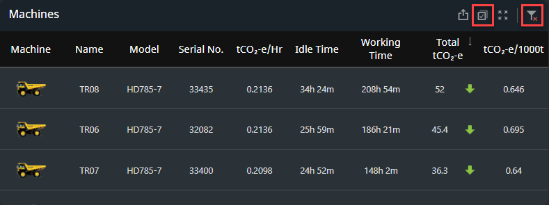
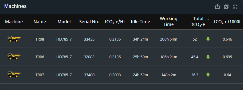
Machines
The Machines widget displays all machines on a site, as well as a summary of their emissions and other attributes.
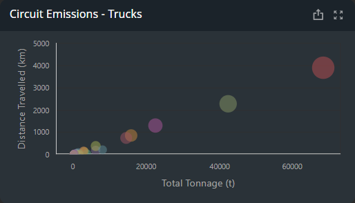
Circuit Emissions
The circuit emissions widget is specific to trucks, and plots the emissions generated on a circuit against the distance travelled and total tonnage hauled by the trucks on this circuit.
A circle's position on the graph shows the distance travelled and tonnage hauled, while the size of the circle shows the amount of emissions produced by the circuit. The larger the circle, the larger the circuit's emissions.
If a circuit covers a long distance with a large load, its emissions (and circle on the graph) should be larger than circuits covering shorter distances with smaller loads. In general, circles in the top-right corner should therefore be larger than circles in the bottom-left corner of the graph.
As shown in the image below, trucks on the purple circuit have covered the most distance and transported the largest tonnage, and should therefore display the largest circle.
However, the yellow circuit (whose trucks have not covered as much distance or transported as much tonnage) displays a larger circle. This indicates the yellow circuit's machine emissions are higher than expected, and there may be an issue or inefficiency with this circuit.
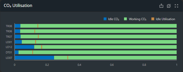
CO2 utilisation
The CO2 utilisation widget is a full-stacked bar chart, where the green and blue bars will always combine to fill the entire graph.
The green bar shows emissions a machine made while working; the blue bar shows emissions a machine made while idle. The orange line shows the percentage of the overall time the machine spent idling.
For example, if the orange line is at 25% of the graph, the machine spent 25% of its time idling. You can hover your cursor over each machine's entry for a tooltip display of the specific numbers recorded for each machine.
When two or more machines present similar working/idle CO2 ratios, the idle utilisation line can show differences in efficiency between machines.
For example, when the orange line is closer to the blue bar, this shows that this machine was utilised more frequently but still maintained the same ratio of emissions as machines that were utilised less frequently.
The green working bar should always be larger than the blue idle bar, as more emissions should be created when a machine is working than when it is idle. If the blue and green bar are similarly sized, this could indicate a machine's emissions are too high when idle.
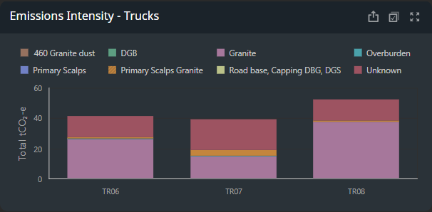
Emissions intensity
The emissions intensity widget displays the total tCO2 -e emitted by a machine. These amounts are broken down by the material hauled; each material is displayed as its own colour on each bar of the graph.
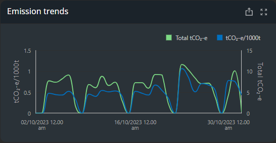
Emission Trends
The emissions trends widget tracks both the total tCO2 -e emitted on site (as shown by the green line) and the tCO2 -e emitted per thousand tonnes hauled (as shown by the blue line).
The Total tCO2 -e (green line) tracks its values on the y-axis on the right-hand side of the graph, while the tCO2 - e/1000t (blue line) tracks its values on the y-axis on the left-hand side of the graph.
You can also hover your cursor over each line to see a tooltip display of the exact numbers recorded at a given point.
The intervals of times and dates displayed on the x-axis vary depending on the timespan set for the dashboard. For example, if a six-month timespan is set, the emission trends graph displays monthly entries on the x-axis; if a week timespan is set, the emission trends graph displays daily entries on the x-axis.
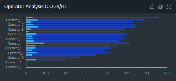
Operator analysis
The operator analysis widget tracks the CO2 per thousand tonnes emitted by an operator per hour.
These amounts are broken down by idling (light blue) and working (dark blue) in the graph. You can hover your cursor over each bar in the graph to see a tooltip display of the exact numbers recorded.