The Production (Trucks) Dashboard
-
You can use the Production (Trucks) dashboard to monitor how efficiently your fleet is being used. You can compare circuits, locations, machine types, or even individual vehicles or operators.
-
You can use the filters in the left-hand side of the top bar of the dashboard to display only data for a given date, time-period, or predefined time span. Click Submit to filter the data based on these settings.
-
You can use the filters in the right-hand side of the top bar to focus on specific shifts, circuits, devices, or operators. These selections update the dashboard automatically.
Production Overview Tab
-
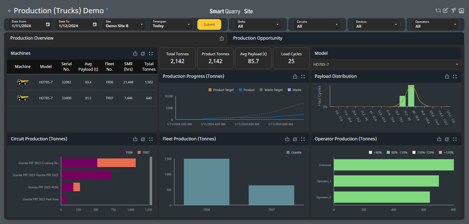
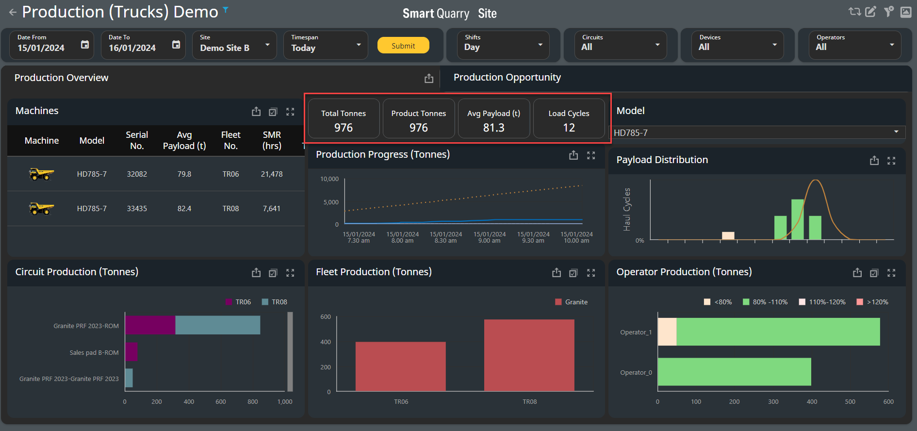
The Production Overview tab displays the production data of your truck fleet for the selected time-period.
Depending on the region you are in Tonnes and Tons will be displayed based on your specific regional measurement system.
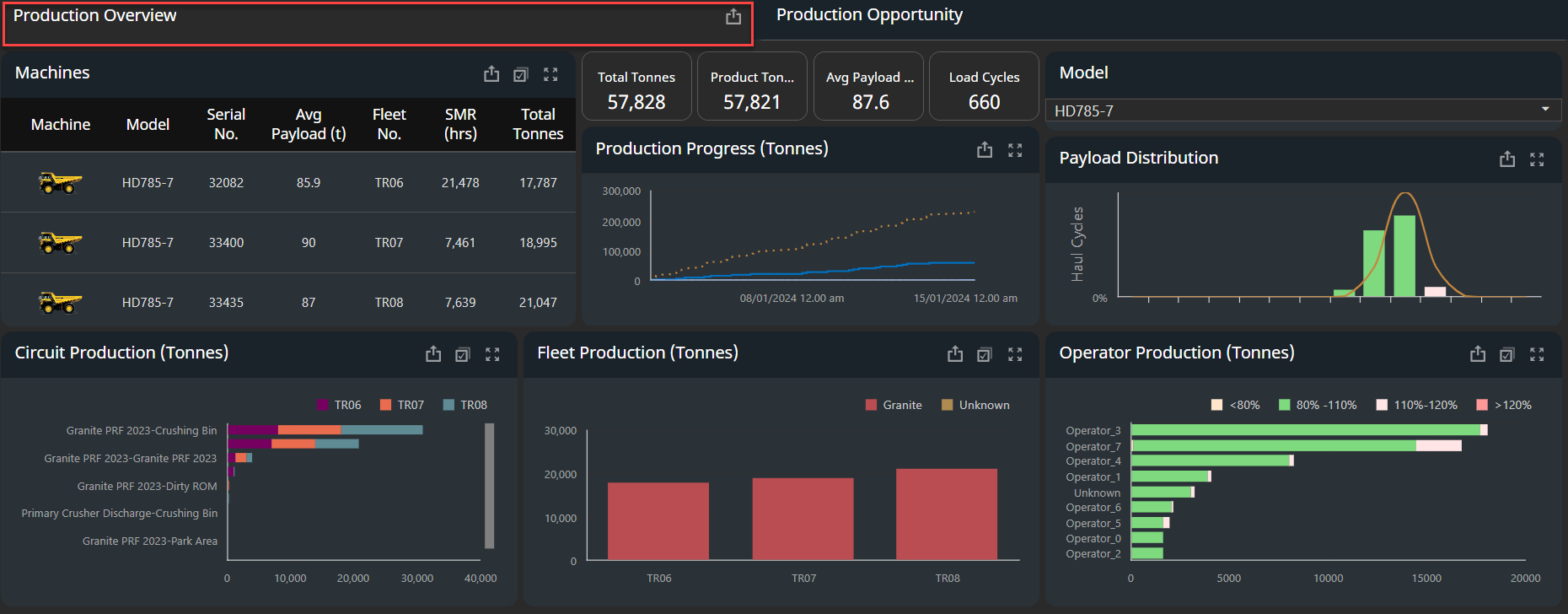
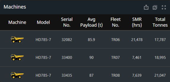
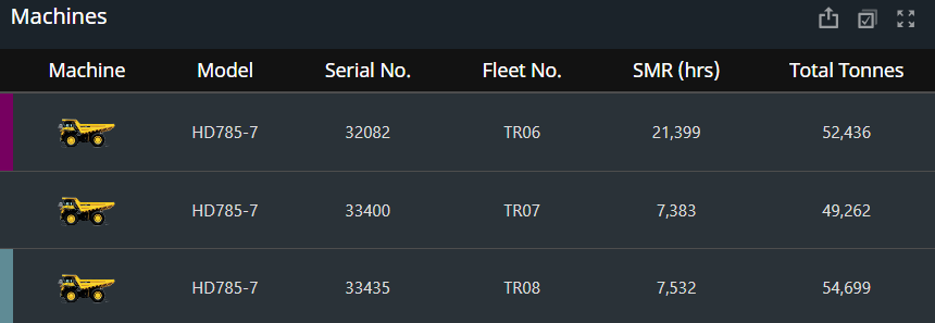
Machines Table
-
The machines table lists all trucks that were active during the selected time span and shift
|
Heading Name |
Description |
|---|---|
|
Machine |
Image that corresponds to the machine model |
|
Model |
Model of the vehicle |
|
Serial Number |
Vehicle serial number |
|
Average Payload [t] |
individual Vehicle average payload [tonnes or ton] based on the region |
|
Fleet Number |
Vehicle call sign |
|
SMR [h] |
Service Meter Reading (SMR) of the vehicle, in hours |
|
Total Tonnes |
The total [tonnes or Tons] of production and waste material this vehicle moved in all load cycles for the selected date and shift |
-
To adjust what information the Machines table displays, use the filters at the top of the dashboard or select one of the following charts
-
Circuit Production (Tonnes) chart
-
Fleet Production (Tonnes) chart
-
Operator Production (Tonnes) chart
This value applies only to vehicles that have load cycles: trucks and loaders
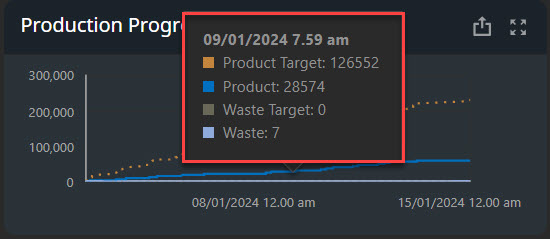
Production Progress (Tonnes) Chart
-
The Production Progress (Tonnes) chart shows the cumulative total weight of material moved as time progresses during the selected time span. Both production and waste material are counted
-
The vertical axis displays the material weight in tonnes and the horizontal axis displays time and date.
In the Production Progress Chart, there are [4] cumulative targets seen here - the material type and targets can been setup in the site master data.
Materials are setup as: Production Material, Waste Material - Targets are also setup with these two categories.
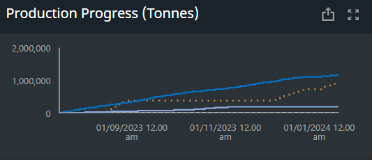
Production Progress - Tool Tip: Hover over the line to see a tooltip that displays the total product and waste material at a given point in time
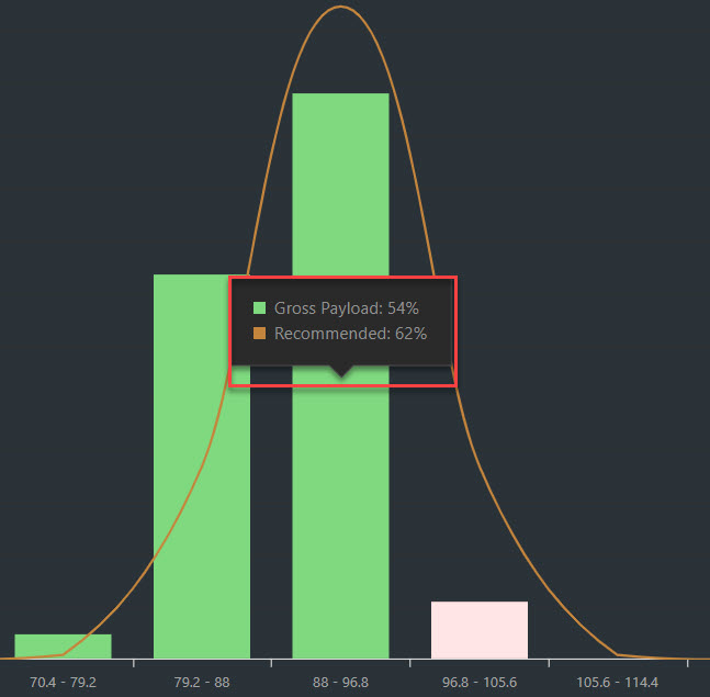
Payload Distribution Chart
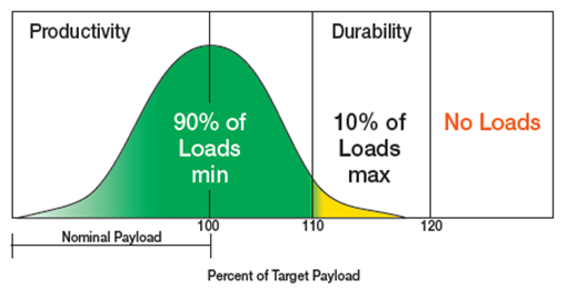
The Payload Distribution chart displays how close the haul cycles got to the ideal distribution of the 10, 10, 20 rule
Please discuss your Payload Policy directly with your OEM provider. Some OEMs have slightly different policies regarding distribution and what rated load can be applied to each truck.
NOTE: Wear packages and liners should be considered and deducted from the rated load applicable to each truck when applicable.
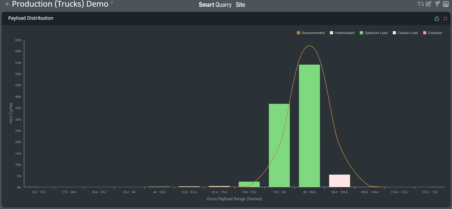
Payload Distribution coloring based on the rated load of the vehicle

Below is Komatsu Payload Policy:
-
Ideally, 90% of total loads should be 90% to 110% of the truck's capacity. Loads within this range are considered Optimum and coloured green.
-
10% of the total loads should be 110% to 120% of the truck's capacity. Loads within this range are considered Cautionary and coloured pink.
-
Any loads over 110% of capacity are considered overloaded and coloured yellow in the above chart, there should be no load exceeding 120% of the trucks rated load.
-
Any loads under 90% of capacity are considered underloaded and coloured green in the table above as the load remains within the rated load.
For ease of the payload distribution within the Smart Quarry Site Card located in the Payload distribution graph we have simplified the coloring so actions can be immediately seen and acted on.
Production Progress - Tool Tip: Hover over a bar in the chart to see a tooltip that displays the percentage of haul cycles that are within that payload range.
-
The Gross Product bars represent the actual percentage of haul cycles within each gross tonnage range and the Recommended line represents the recommended distribution of haul cycles within each gross tonnage range.
-
The Recommended line is a bell curve where 100% to 110% of the rated capacity of the selected truck model [less any wear or liner package] is the mean of the normal distribution. The curve peaks at 105% of the truck's capacity. The nominal payload capacity for each truck is pre-loaded into the Smart Quarry Site system.
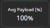
Where there are multiple trucks with varying payloads - either by difference in OEM or truck size the payload distribution graph will only show one of the selected vehicles payload distribution, the average payload for sites where there are multiple fleets varying in rated load will be displayed in the
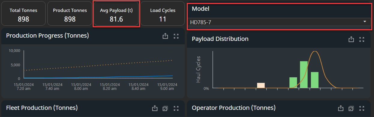
The Summary of the payload distribution of the fleet is shown as a single number or percentage %
-
If the truck fleet have the same payload - All trucks payload distribution will be shown in the Payload distribution chart and the summary chart bove will show the average payload of the fleet as Tonnes or Tons depending on your region.
-
If the payload is varied on the site by OEM type or Truck size the average payload of the fleet will be shown in % percentage
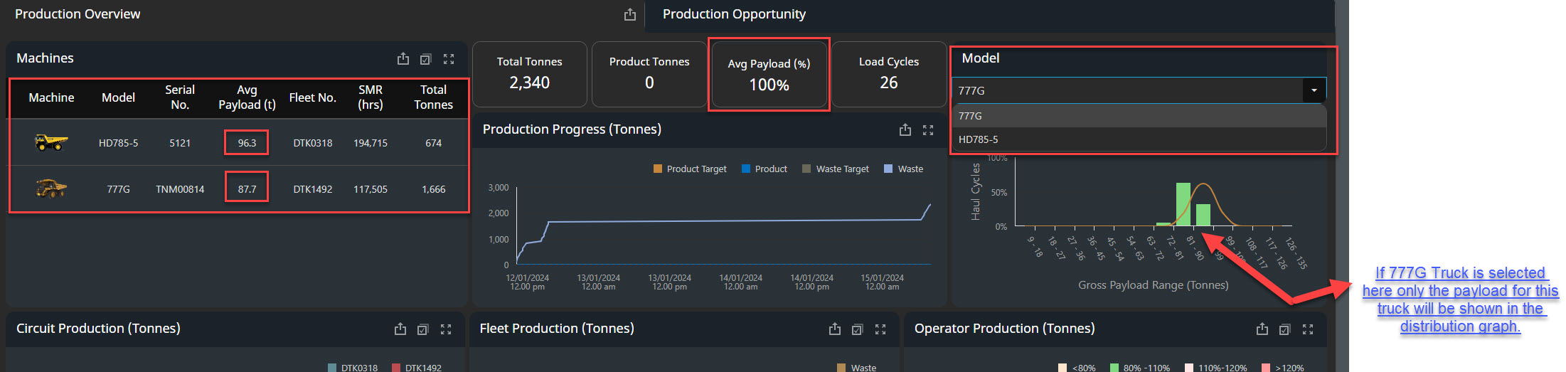
Circuit Production (Tonnes) Chart
Circuit is defined as the haul truck route on the site and can be categorised in the site master data based on the haul route or circuits name, material type or both. These circuits are also Geo-Fenced in the site for reporting and visualisation of the data within these dashboards,
-
The Circuit Production (Tonnes) chart displays which circuits were the most productive for the selected time span. Circuits are defined by the load and dump locations of the load cycles that occurred during the selected time span
-
The vertical axis displays the circuits and the horizontal axis displays the material moved, in tonnes
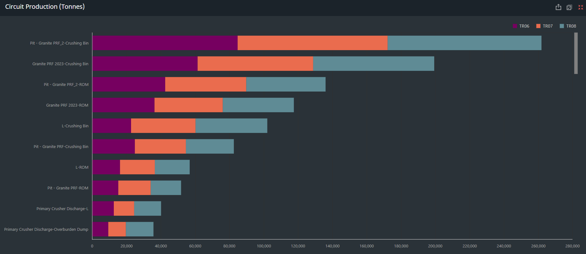
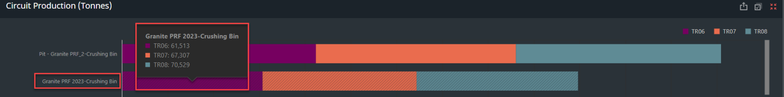
Circuit Production - Tool Tip: Hover over a bar in the chart to see a tooltip that displays the total tonnes moved in the selected timespan.
-
To see a total tonnage for one of the circuits, click its bar in the chart. The whole dashboard updates and the tonnage for that circuit is displayed in the middle of the dashboard.
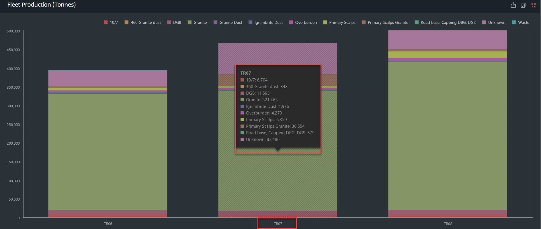
Fleet Production Tonnes Chart
The Fleet Production Tonnes chart visualises the material type and material moved within each circuit by each truck.
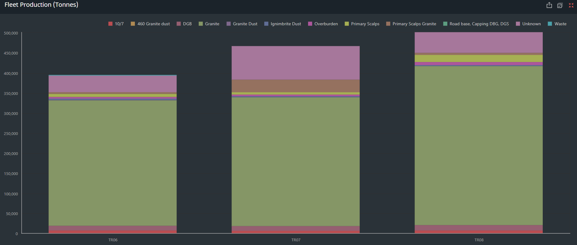
Fleet Production - Tool Tip: Hover over a bar in the chart to see a tooltip that displays the material type and Tonnes or Tons moved in the specified and selected timespan.
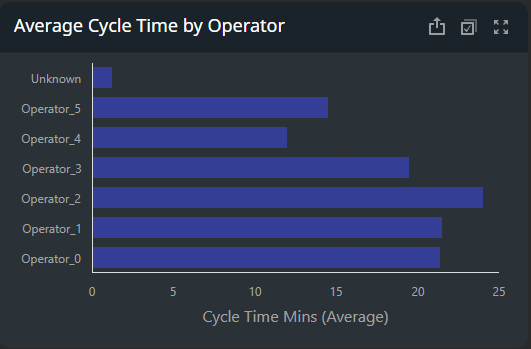
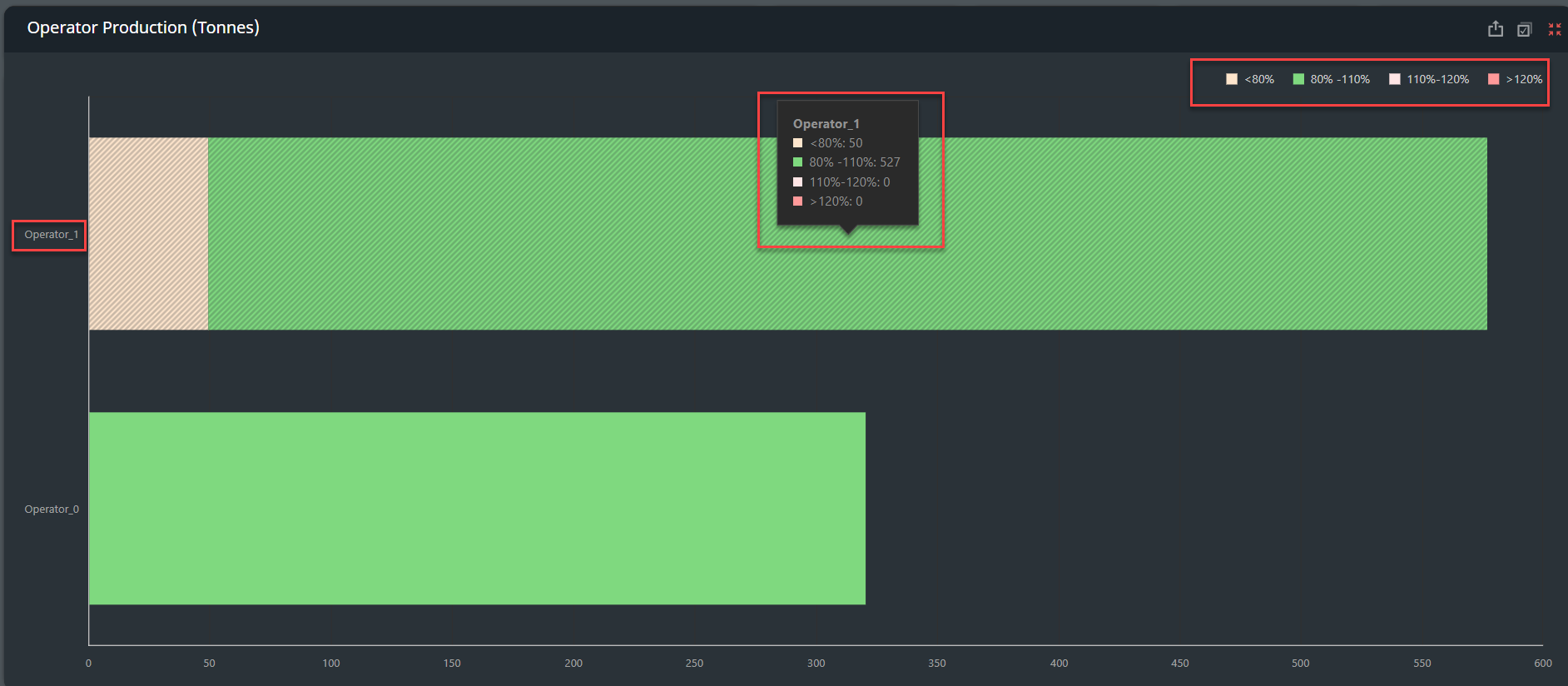
Operator Production (Tonnes) Chart
-
The Operator Production (Tonnes) chart displays which operators were the most productive and efficient for the selected time span.
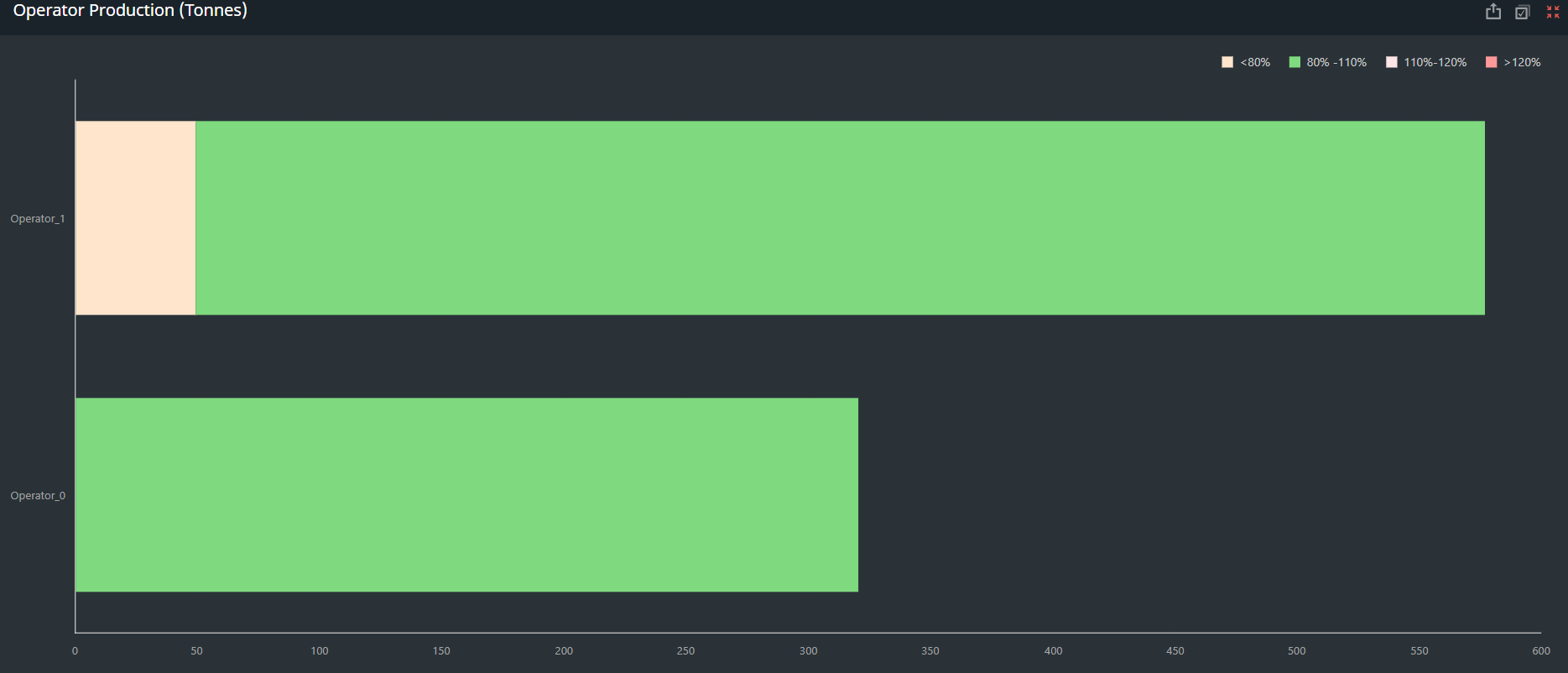
Production Progress - Tool Tip: Hover over a bar in the chart to see a tooltip that displays the name of the operator and how much of their total tonnage was in each of the payload ranges.
-
Loads under 80% of capacity are considered underloaded and coloured orange.
-
Loads between 80% and 110% of the truck's capacity are considered Optimum and coloured green.
-
Loads between 110% and 120% of the truck's capacity are considered Cautionary and coloured pink.
-
Loads over 120% of capacity are considered overloaded and coloured red
-
The vertical axis of the chart displays the operators and the horizontal axis displays the material moved, in tonnes.
-
To see a total tonnage for one of the operators, click their bar in the chart. The whole dashboard updates and the tonnage for that operator is displayed in the middle of the dashboard
Fleet or Individual Machine Summary Card
-
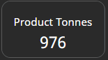
The fleet summary cards below cover the following:
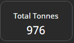
Total Tonnes summary for you fleet or machine: Total Tonnes or Tons depending on your region for the timespan, shift, circuit, device, operators is displayed here as a summary for you fleet.
Product Tonnes Summary for you fleet or machine: These are tonnes that have had a designated as production material - Total Tonnes or Tons depending on your region for the timespan, shift, circuit, device, operators is displayed here as a summary for you fleet.
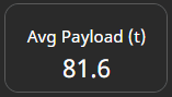
Average Payload [tonnes] Summary for you fleet or machine: These are tonnes that have had a designated as production material - Total Tonnes or Tons depending on your region for the timespan, shift, circuit, device, operators is displayed here as a summary for you fleet.
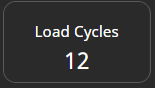
Load Cycles Summary for you fleet or machine: These are total cycles depending on your selection of - timespan, shift, circuit, device, operators is displayed here as a summary for you fleet or selected devices..
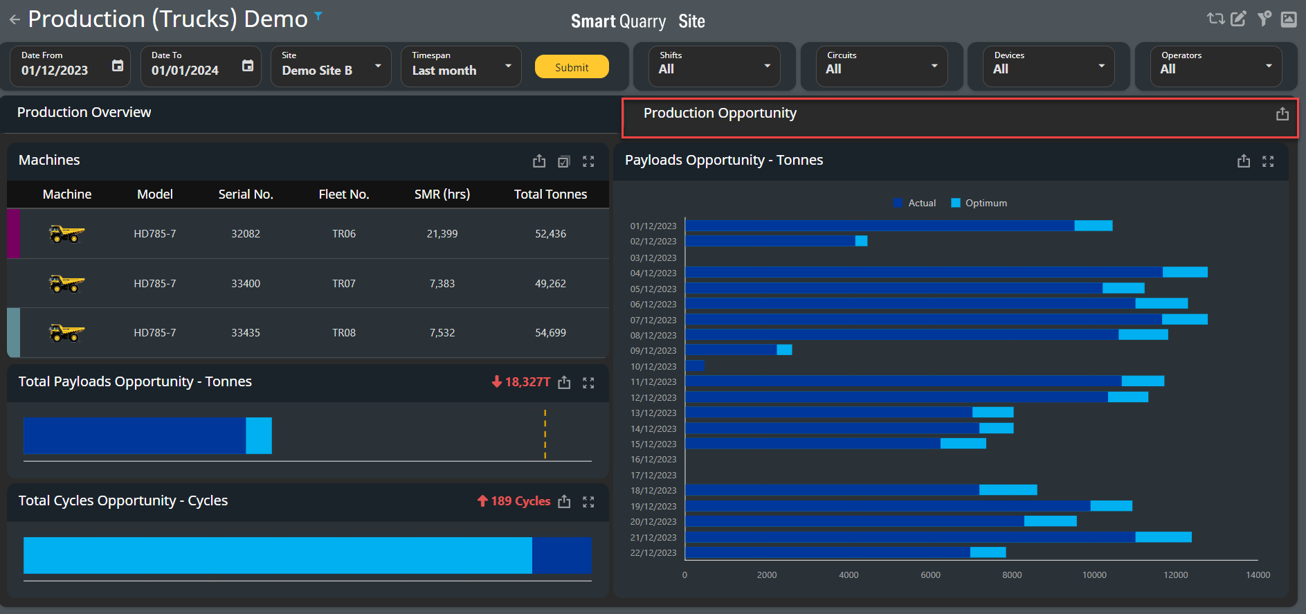
Production opportunity Tab
The Production Opportunity tab compares the actual production results to the ideal production results for the selected time span.
-
The tab is an additional tab within the Production Trucks Dashboard and can be found on the Top Right side.
-
The ideal production tonnage calculation is based on which vehicles were working and what their maximum capacities are. The nominal payload capacity for each truck is pre-loaded into the Komatsu iSite system
Machines Table
-
The machines table lists all trucks that were active during the selected time span and shift.
|
Heading Name |
Description |
|---|---|
|
Machine |
Image that corresponds to the machine model |
|
Model |
Model of the vehicle |
|
Serial Number |
Vehicle serial number |
|
Fleet Number |
Vehicle call sign |
|
SMR [h] |
Service Meter Reading (SMR) of the vehicle, in hours |
|
Total Tonnes |
The total [tonnes or Tons] of production and waste material this vehicle moved in all load cycles for the selected date and shift |
This value applies only to vehicles that have load cycles: trucks and loaders
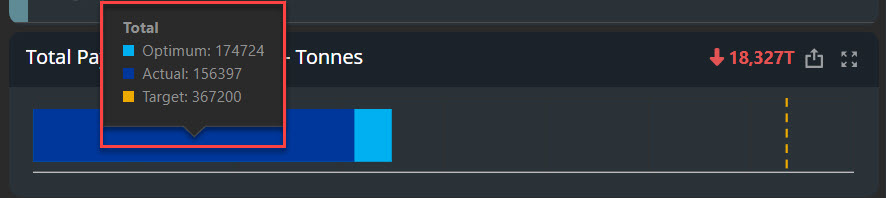
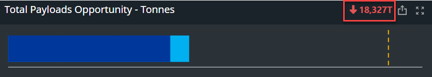
Total Payloads Opportunity - Tonnes Chart
-
The Total Payloads Opportunity - Tonnes chart compares the actual production tonnage to the optimal production tonnage for the selected time span.
-
The optimal production tonnage is based on the amount of material the fleet could move if they all worked at 110% capacity
-
The dotted Yellow line represents targets set by loading tool at the iste - this is and can be setup in the site master data
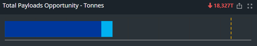
Total Payloads Opportunity - Tonnes - Tool Tip: Hover over the bar in the chart to see a tooltip that displays the actual and optimal production tonnages and displays any targets set at the site to compare actual against target.
-
A red number in the chart header indicates that less material was moved during the selected time span than is optimal. A green number indicates that more material was moved than is optimal, which means that the fleet was operating at more than 110% capacity
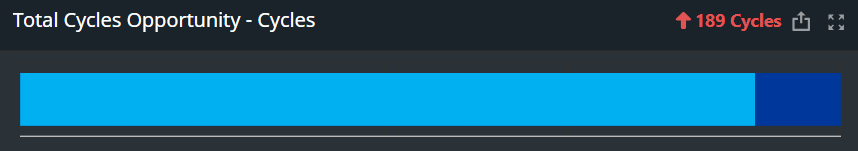
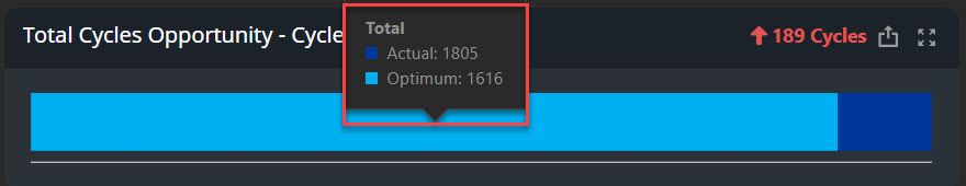
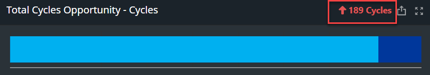
Total Cycles Opportunity - Cycles chart
-
The Total Cycles Opportunity - Cycles chart compares the actual number of load cycles to the optimal number of load cycles for the selected time span.
-
The number of optimal load cycles is based on the number of load cycles the fleet would complete if they all worked at 110% capacity
Total Cycle Opportunity - Cycles - Tooltip: Hover over the bar in the chart to see a tooltip that displays the number of actual and optimal production cycles.
-
A red number in the chart header indicates that more load cycles were completed than is optimal. A green number indicates that fewer load cycles were completed than is optimal, which indicates that the trucks were operating at more than 110% capacity
Payloads Opportunity - Tonnes Chart
-
The Payloads Opportunity - Tonnes chart compares the actual production tonnage to the optimal production tonnage for each day that was worked within the selected time span.
-
As and example: When a time span of multiple months is selected, the Payloads Opportunity - Tonnes chart displays a bar for each month.
-
The optimal production tonnage is based on the amount of material the fleet could move if they all worked at 110% capacity.
-
The vertical axis displays the dates, and the horizontal axis displays the production tonnage.
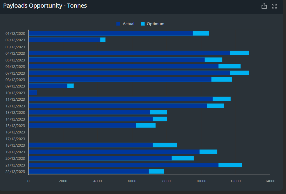
Total Cycle Opportunity - Cycles - Tooltip: Hover over a bar in the chart to see a tooltip that displays the date and time, and the actual and optimal production tonnages for that date.
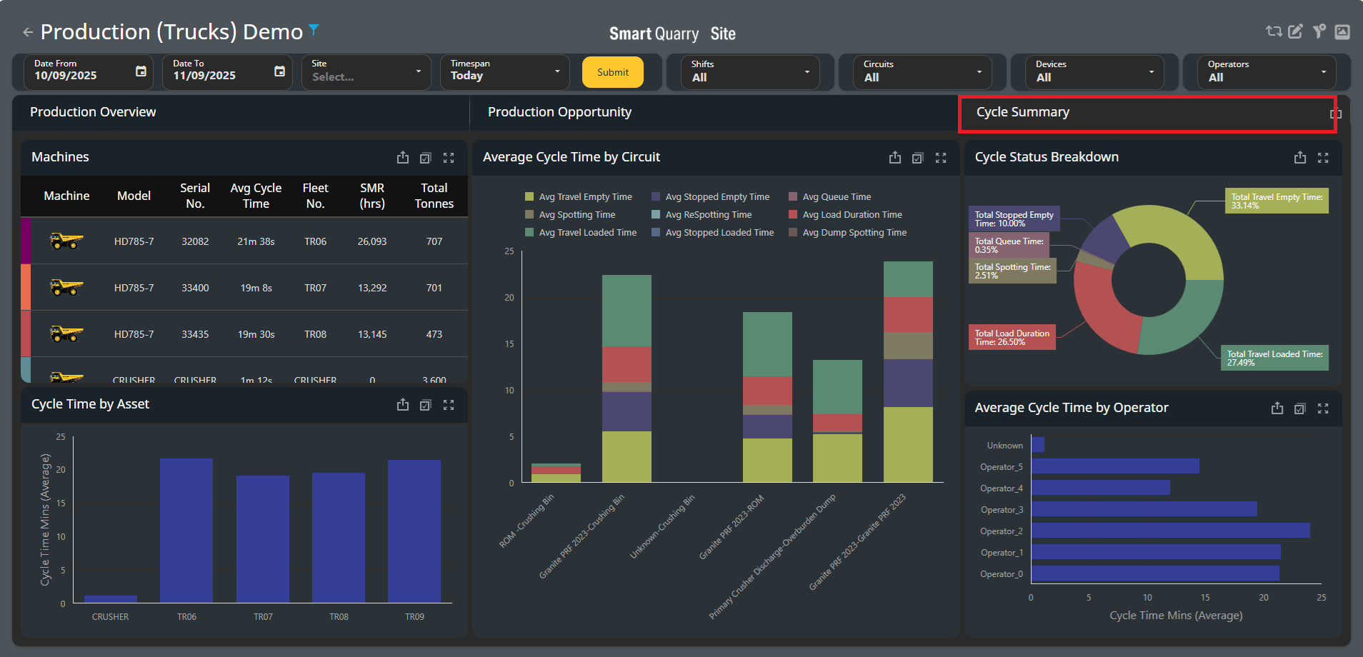
Cycle Summary
This Cycle Summary dashboard enhancement delivers the circuit-focused insights our customers have been asking for, providing unprecedented visibility into quarry operations.
-
New dedicated tab for detailed cycle time tracking
-
Provides production insights through a circuit lens
-
Identify bottlenecks within specific circuit segments
-
Analise performance trends across different operational states
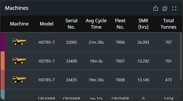
Machines
-
The machines table lists all trucks that were active during the selected time span and shift.
|
Heading Name |
Description |
|---|---|
|
Machine |
Image that corresponds to the machine model |
|
Model |
Model of the vehicle |
|
Serial Number |
Vehicle serial number |
|
Avg Cycle Time |
Average Cycle time |
|
Fleet Number |
Vehicle call sign |
|
SMR [h] |
Service Meter Reading (SMR) of the vehicle, in hours |
|
Total Tonnes |
The total [tonnes or Tons] of production and waste material this vehicle moved in all load cycles for the selected date and shift |
This value applies only to vehicles that have load cycles: trucks and loaders
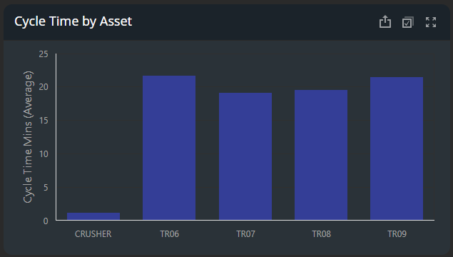
Cycle Time by Asset
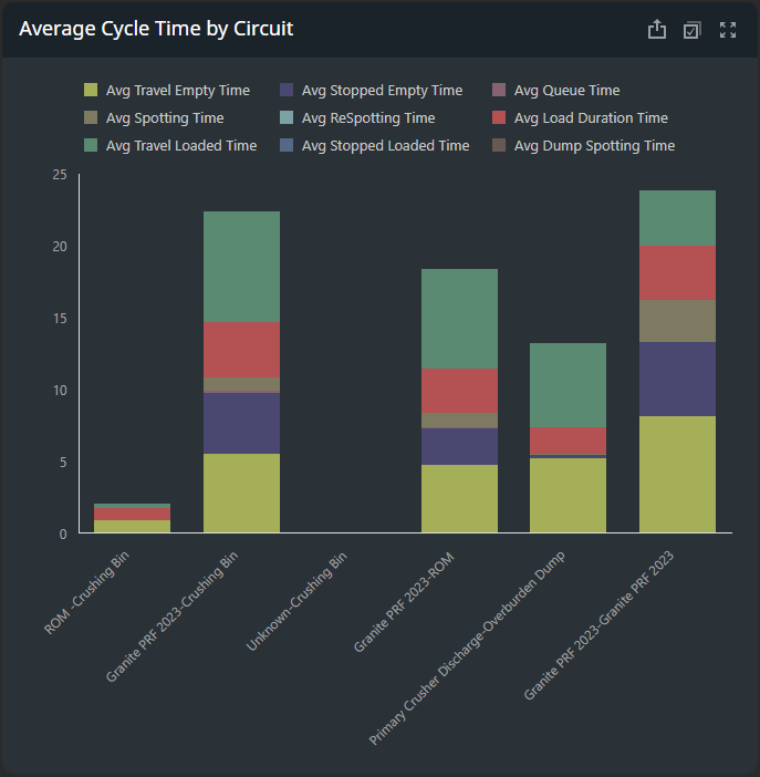
Average Cycle Time by Circuit
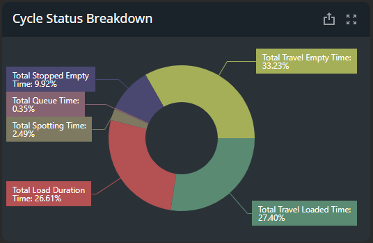
Cycle Status Breakdown
Average Cycle Time by Operator